Smarter User Journeys: Smart Lockers UX Redesign

Sezaam is a French smart-locker company that simplifies parcel deliveries for residents, companies, and delivery professionals.
.avif)
The goal of this project was to boost adoption rates by simplifying user journeys for both logisticians and users, while improving clarity, consistency, and feedback across the interface. Although the release included major back-end and firmware updates, this article is about the interface rework: bringing coherence, accessibility, and scalability to a growing product.
Here’s what I’ll cover in this article:
- The pain points we observed and how they shaped the redesign
- How we strove to build solid foundations
- The key improvements that were made
The challenge
The previous interface was functional but limited. It allowed users to deposit and retrieve parcels, yet the experience was inconsistent and confusing:
- Flows were complex and unintuitive
- Visual patterns were mixed across screens
- The front end wasn’t ready for multilingual expansion as it was not responsive
In short, the interface was fully functional but had a lot of limitations and brought a lot of hesitation and guesswork to users, that friction impacted everyone: end users, who faced confusion; our support teams, who had to handle more incidents; and also our product team, as we couldn’t easily iterate or test new features.

Objectives of the rework
This wasn’t just a visual refresh or a flow clean-up, it was a chance to rebuild foundations. Our goal: make the new interface simpler, smarter and scalable, with stronger accessibility and international reach.
- Simplify user journeys: The first priority was to remove friction. We observed real users interacting with the lockers and identified where they hesitated or backtracked.
- Build a scalable design system: Before this rework, integrating any new feature or even making small UI changes to the interface was either a headache or a puzzle. We wanted to build a solid design system that would make product iterations faster and also development quicker.
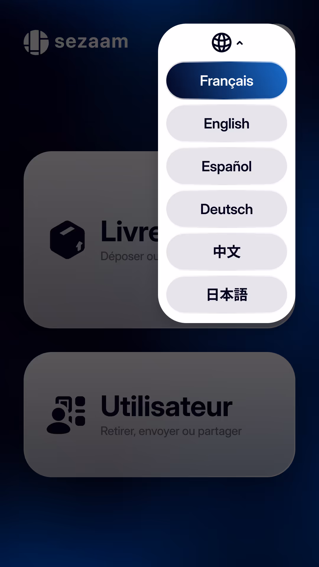
- Enable multilingual support: As Sezaam expands to new markets and multicultural buildings, language became a core usability issue, the goal here was simply to make the locker accessible to anyone.
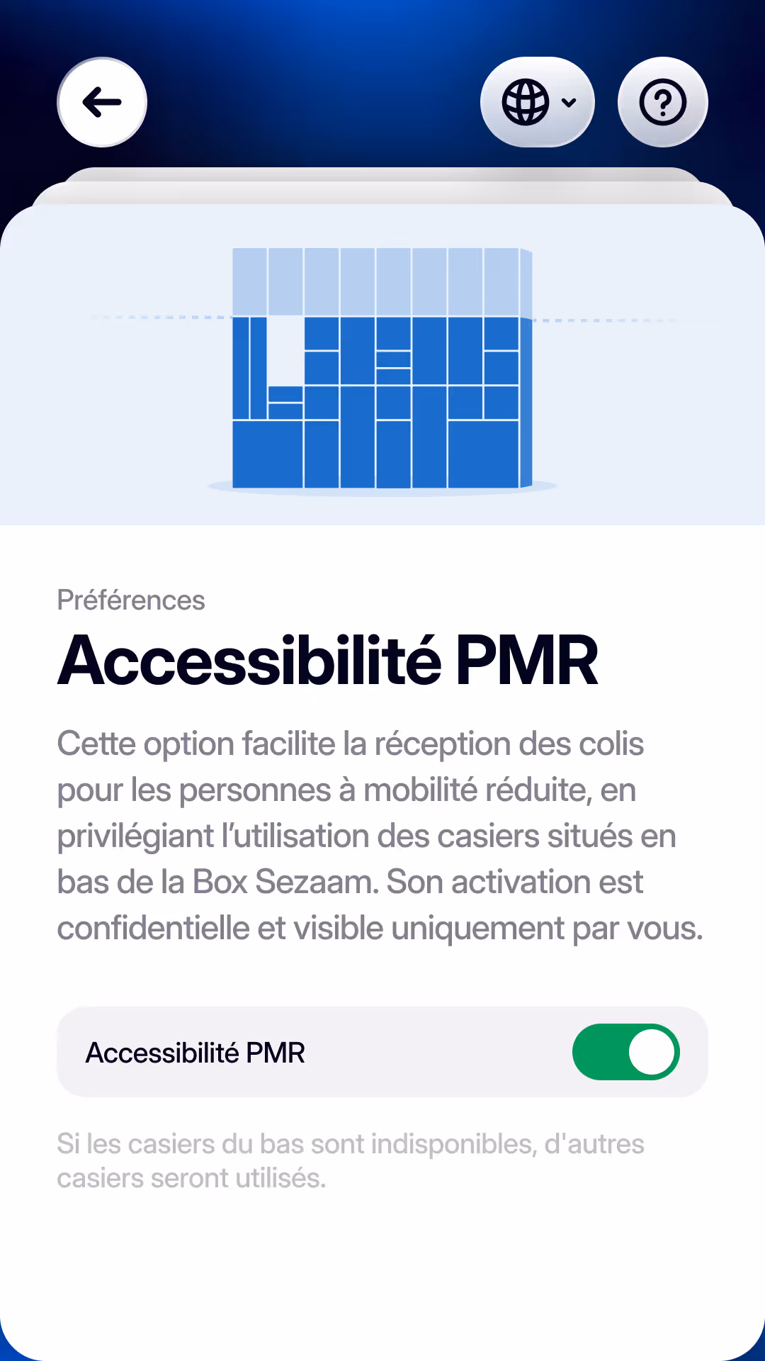
- Enhance accessibility and information clarity: The previous interface lacked visual hierarchy, which made it hard for users to follow. We had to strengthen contrasts, refine the typography, and structured content so it stays legible to everyone, even in bright lobbies.
Key improvements
Each improvement was driven by real-world testing and feedback, focusing on reducing friction. Here are the main improvements:
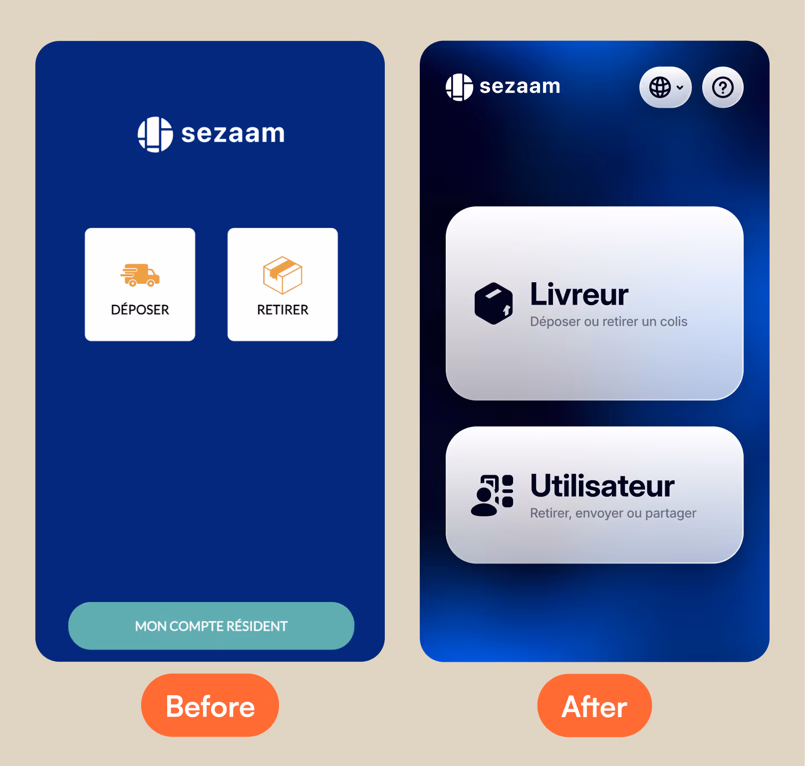
- New navigation system: The entire navigation was restructured to make it faster, clearer, and more responsive. Buttons were repositioned for easier reach, animations were improved for fluidity, and the tunnels now guide users naturally from one step to the next with ease.
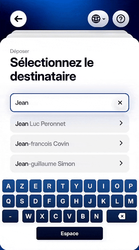
- Reworked delivery and pickup flows: The locker’s core flows were redesigned to feel more guiding and reassuring. The parkour has now been divided between logistician and users, allowing us to display more coherent information regarding who is using the interface.

- Language switcher and in-context FAQ: Multilingual support was complemented by an always-accessible language selector and FAQ modal. These tools remain available throughout the user journey, helping anyone find answers instantly without leaving the flow.
- Additional key features taking or solution to the next level: With this new version, we introduced two new key features: the first enables users with reduced mobility to receive their deliveries exclusively in the lower compartments of our lockers, with full privacy of this option being activated. The second allows users to link their building’s RFID badge to their Sezaam account, letting them retrieve their parcels with a single badge swipe.