How To Visualize Data for Product Teams

It’s pretty easy to drown in data while searching for insights. In this article, I’ll show you why building data visualization dashboards has never been easier and how the right tool can turn anyone into a stats nerd.
Here’s what I’ll talk about in this article:
- How data visualization tools work
- Introducing Metabase and Grafana
- How I take advantage of those tools
How data visualization works
Simply put, data visualization turns raw data into clear charts and dashboards that surface patterns and real-time signals to help you steer your strategies. But not all data visualization tools are trying to solve the same problem. In this article, I’ll focus on two tools I use daily: Metabase and Grafana.
What is Metabase?
Metabase is a visualization layer for your database. It allows anyone in your team to quickly query, without any knowledge of SQL, while having the data displayed in simple, easy-to-read formats (if you don’t know what SQL is, then it’s the right tool for you!).
What Metabase is about:
- Asking questions in plain language, no SQL knowledge required
- Turning answers into polished, shareable charts and dashboards in minutes
- Finding unexpected/correlated KPIs through AI-generated reporting (X-ray tables)
The best thing about Metabase is the self-serve mindset it enables. Anyone, from any team, can access the data autonomously and move faster.
What is Grafana?
If Metabase helps you understand what happened, Grafana helps you catch what’s happening in real time. This tool has more of a “monitoring” kind of purpose, it is used to track live metrics, spot anomalies, and trigger alerts based on rules you create.
What Grafana is about:
- Building live dashboards for ops, engineering, and product teams
- Tracking time-based metrics like uptime, traffic volume, CPU or memory usage
- Creating live maps using geospatial data
- Setting up alerts that trigger on demand
Although it has a steeper learning curve than Metabase, it’s far more powerful and can be pushed even further thanks to a vast ecosystem of community-built plugins.
Real-life use cases
To better showcase these tools, I’ll highlight their features through my day‑to‑day work as a Product Manager for Sezaam, a bustling startup that designs and operates smart lockers used for parcel deliveries and concierge services.
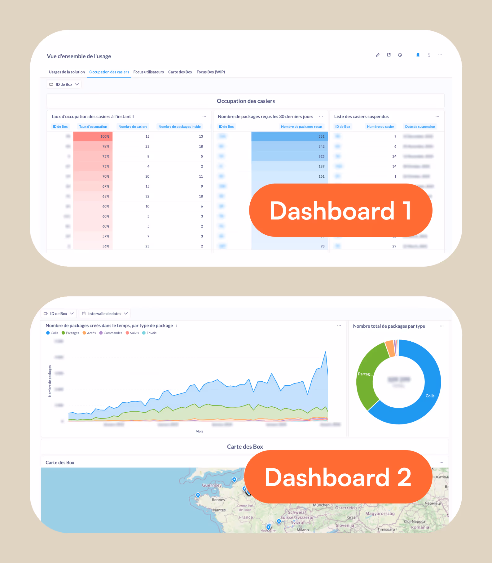
I use Metabase to track insights
Metabase helps me track what I call “cold KPIs”, which are non-sensitive KPIs that help me steer product strategy (e.g., how users move through the UI, which locker sizes get used most, or the moments our solution is most in demand).
A no-code solution for data visualization
Metabase’s no‑code workflow is built around “questions”: visual, point-and-click queries that feel like any other no-code builder. From there, you can tailor how results are displayed (e.g. bar or line charts, area charts, scatter plots, pie charts, tables, and even maps), fine-tuning colors, labels, axes, and legends to match your needs.
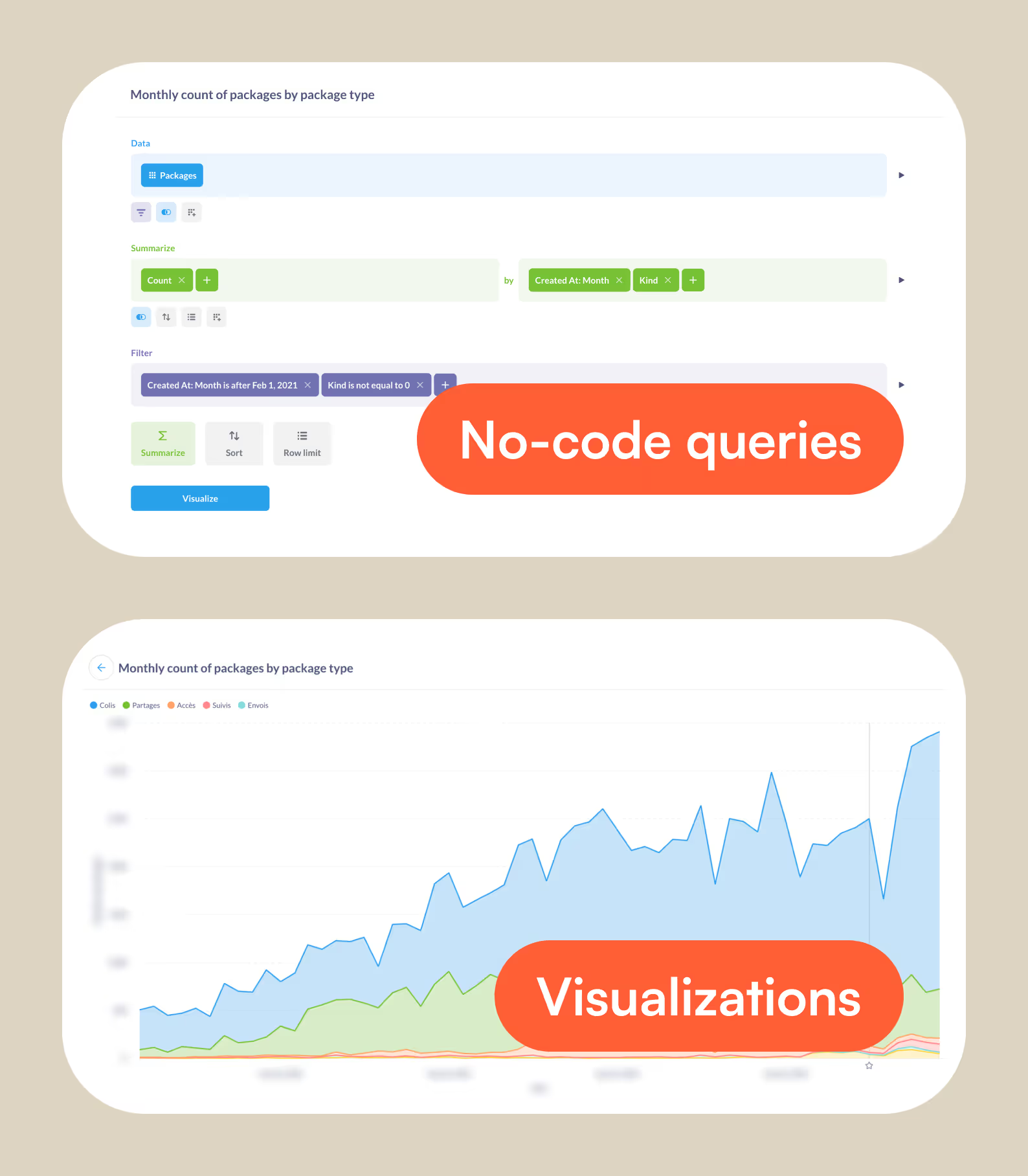
Create dashboards in no time
Once you’ve built a set of relevant questions, you can turn them into a clear narrative by assembling them into dashboards. Metabase makes it easy to drag, drop, and resize charts into a layout that tells the story, then add global filters (date range, location, segment, device, etc.) so anyone can explore the same dashboard through their own lens. You can also polish the reading experience with conditional formatting to help spot trends. The result: lightweight, always-up-to-date, and easy-to-maintain dashboards.
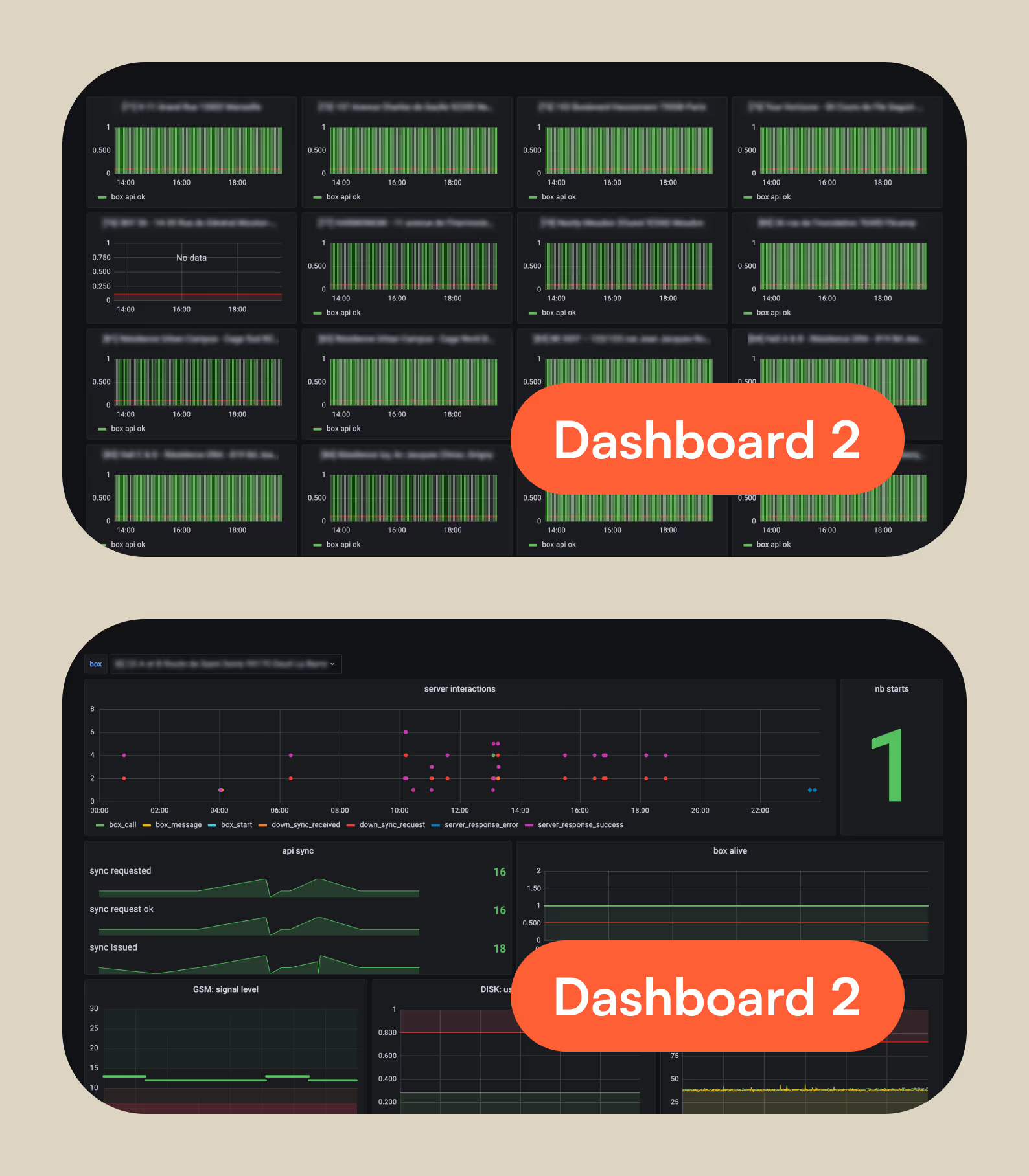
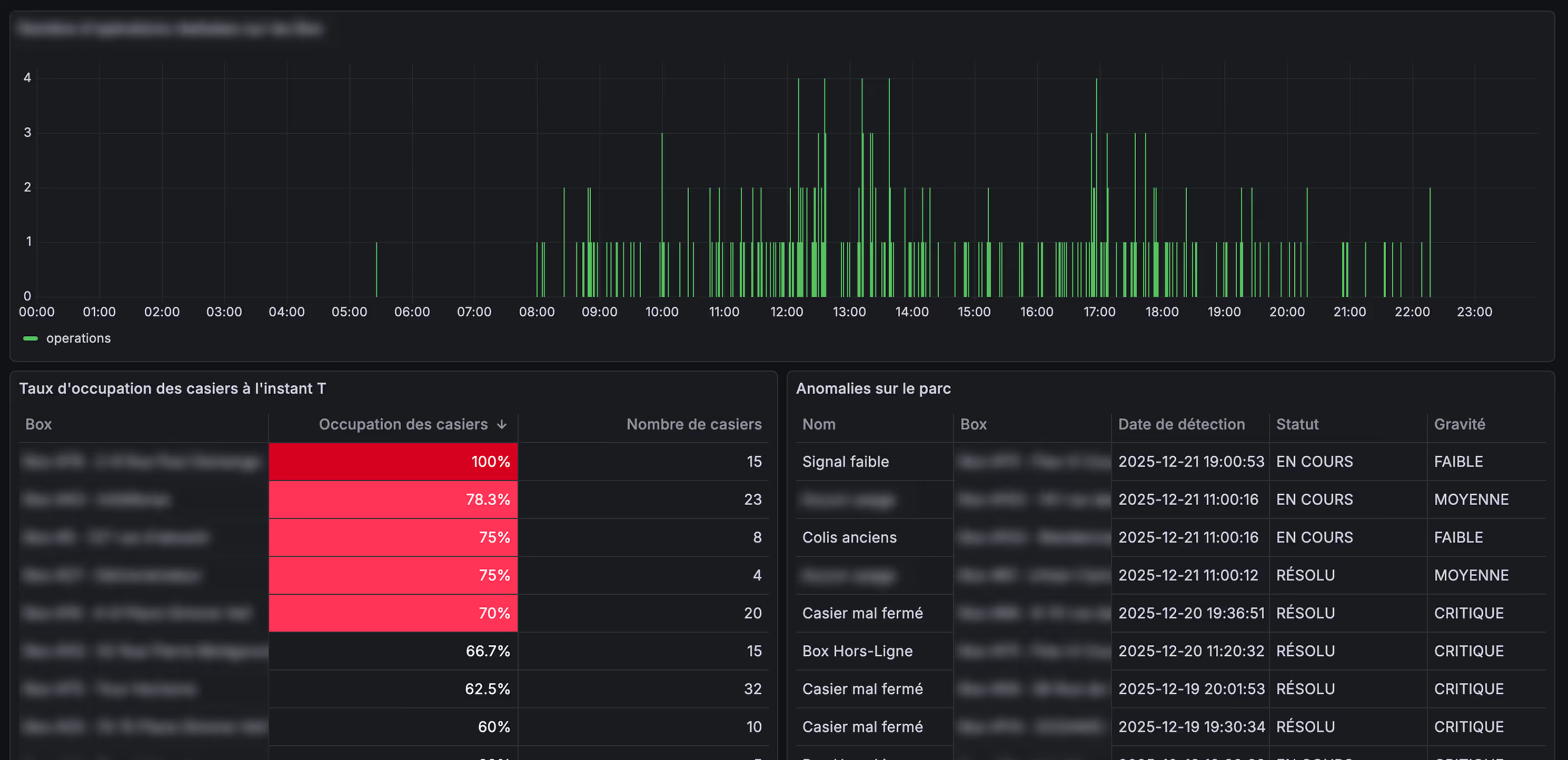
Real-time monitoring with Grafana
Grafana is my go-to for anything live, operational, and time-sensitive metrics. It can feel more complex at first, but that complexity comes with more depth: it’s built for real-time monitoring, long-running dashboards, and production-grade alerting.
Always-on dashboards
Grafana’s approach to queries and dashboard building is fairly similar to Metabase, or any other data visualization tool: you create panels from queries, then arrange them into dashboards. The difference is intent: Grafana dashboards are designed to run continuously, refresh automatically, and stay readable from a distance (perfect for display on an office screen).
For this use case, I used Grafana to track live usage and availability across our fleet, so everyone in the office can instantly see what’s happening (busy periods, availability drops, anomalies) without having to ask or dig into our existing tools.
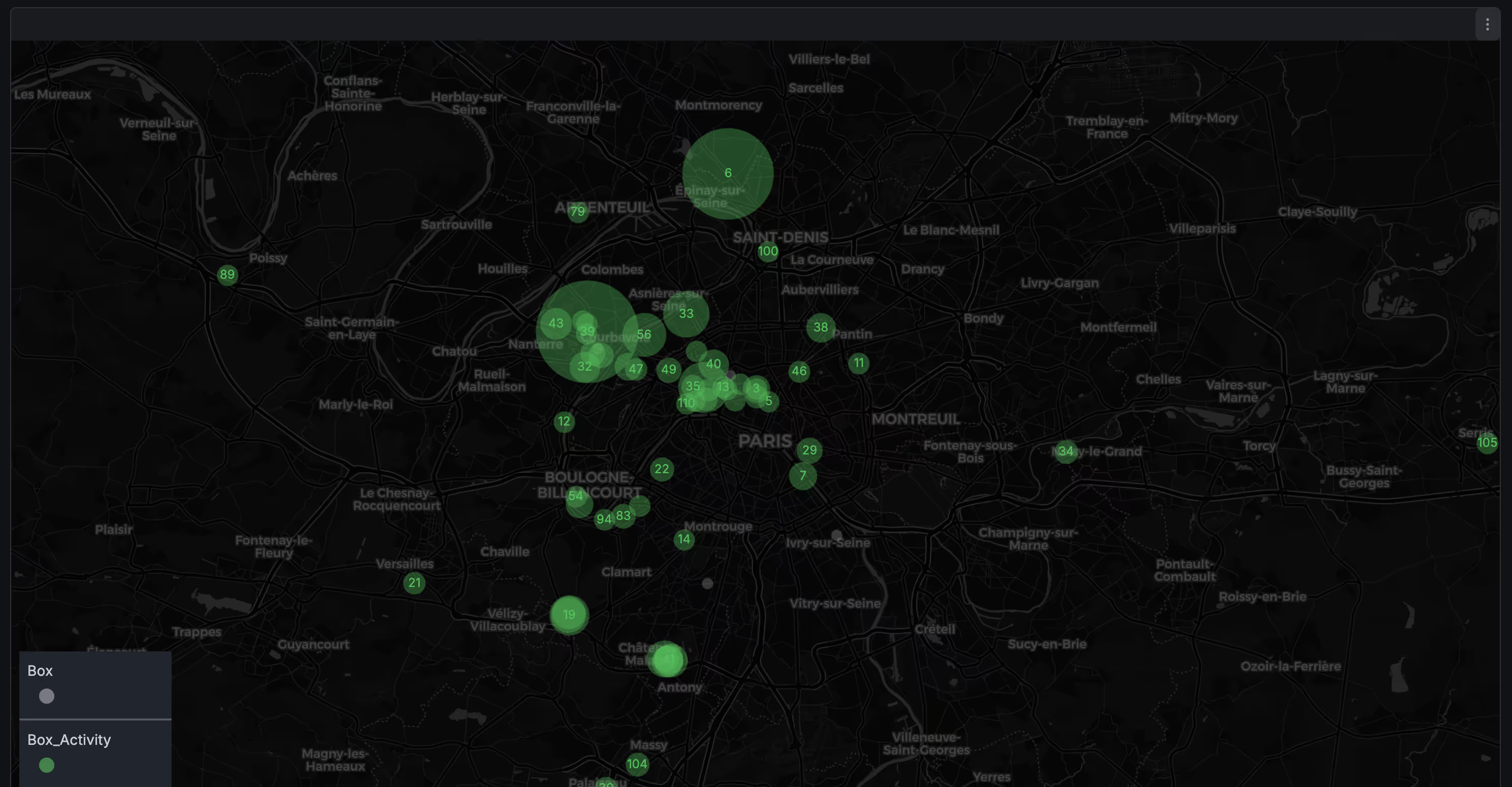
Fleet awareness
Grafana’s Geomap panels are especially useful: they turn raw location data into an at-a-glance view of hotspots or busy areas. It’s a simple visual layer that reduces guesswork, accelerates decisions, and aligns the whole team around the same operational reality.
Alerting that closes the loop
Finally, Grafana becomes truly powerful when you pair it with its alerting feature. You can define thresholds and anomaly rules (low signal, lockers at full capacity, unexpected usage spikes, etc.) and automatically trigger notifications (via email, Slack, Discord...) so dashboards don’t just inform, they drive action.
Wrapping up
Data visualization doesn’t have to be intimidating. Those tools are a practical way to turn raw data into useful insights. Also, don’t forget that AI can help you get up to speed fast, whether it’s translating a question into a query, suggesting KPIs to track, or explaining unfamiliar concepts!
Ultimately, the value isn’t in the charts, it’s in what you do next 😉
